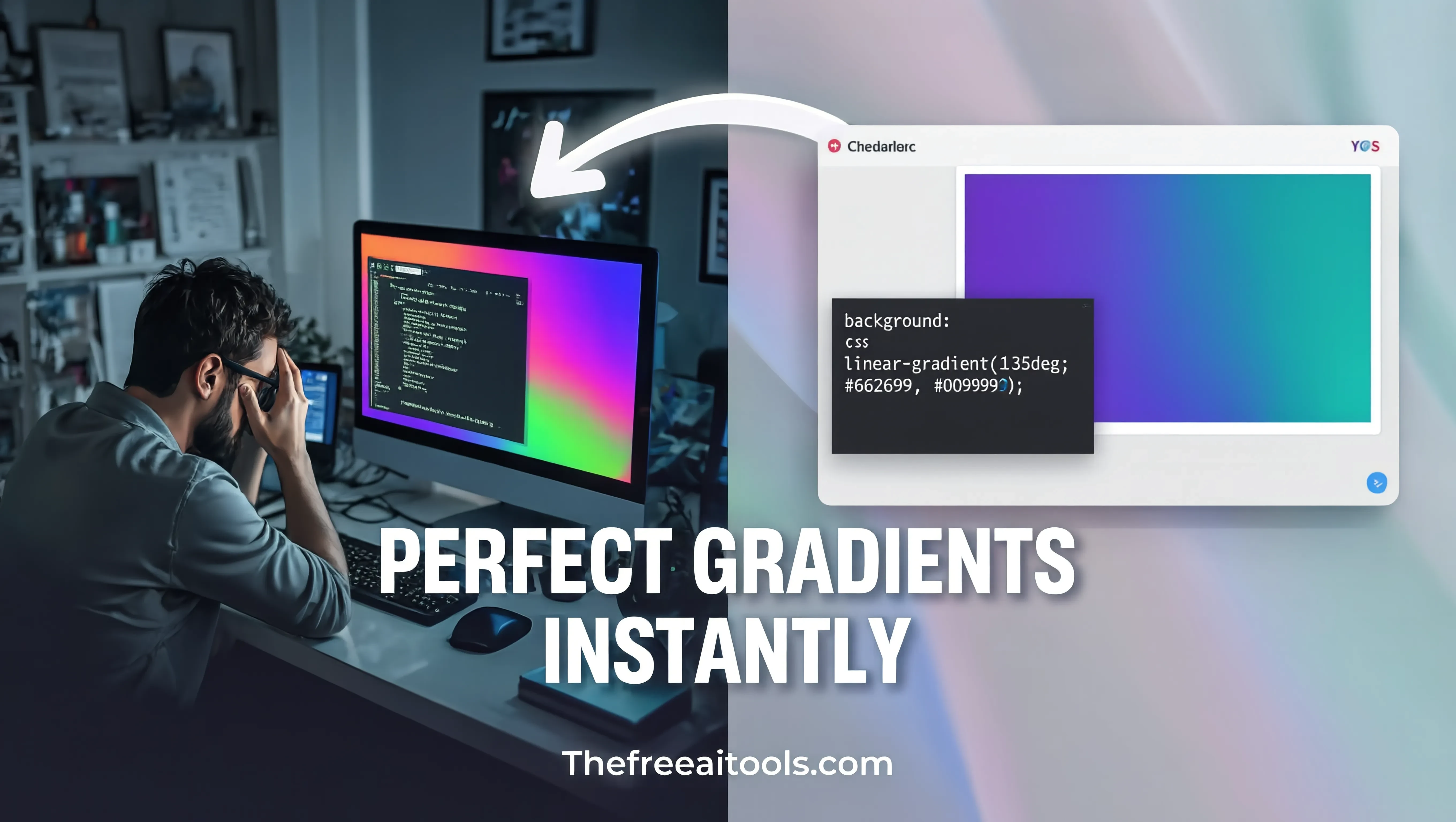
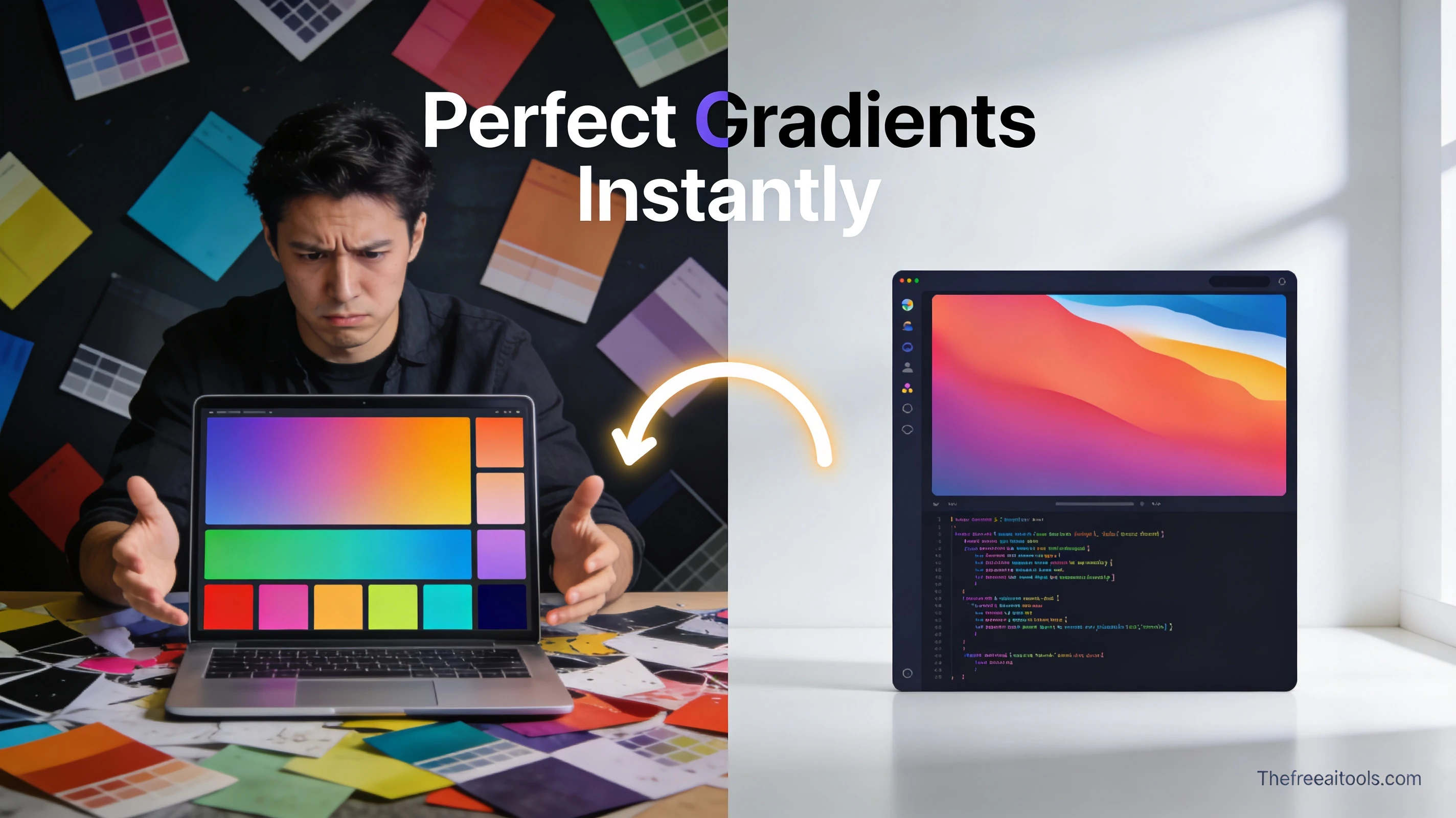
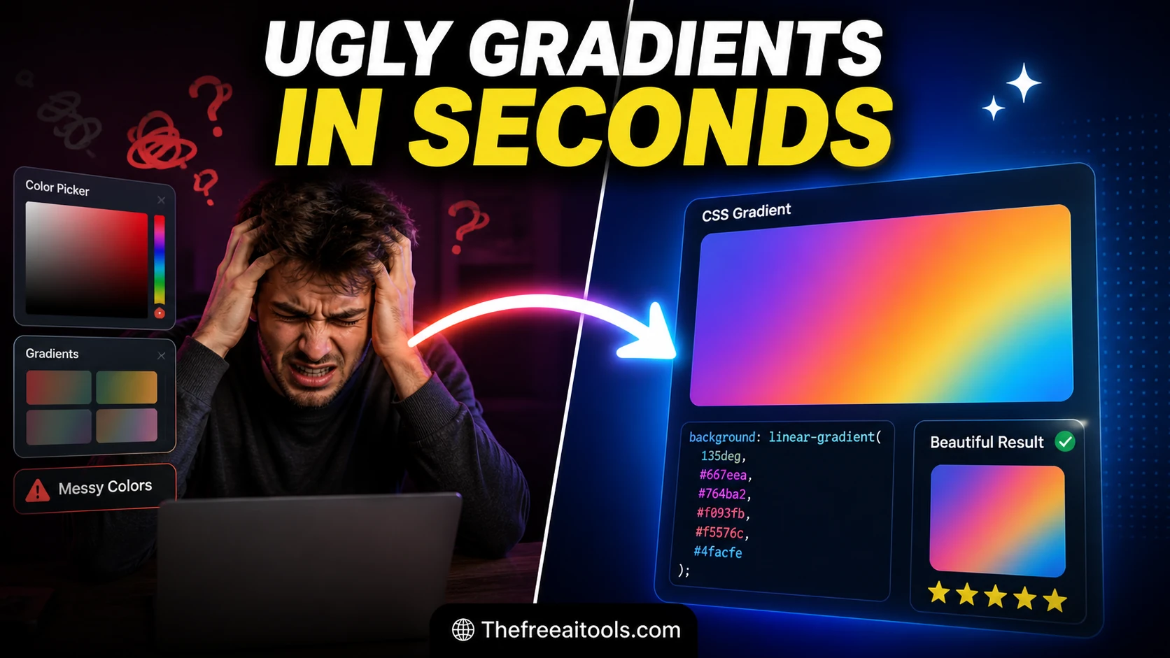
CSS Gradient Generator
Create linear and radial gradients with multiple color stops — copy ready-to-use CSS background-image code.

Build gradients, box shadows, animations, filters, spacing scales, and CSS snippets with live previews.
Front-end design work lives in tiny, repeated decisions: the exact radius on a card corner, the spread and blur of a shadow that reads as 'elevated' instead of 'muddy', the two colour stops that make a gradient feel intentional rather than accidental. Doing this by hand-editing CSS and refreshing the browser is slow, and most online generators bury the output in ads or paywalls. Our free design tools online give you live visual feedback and copy-ready CSS in the browser — no account, no watermark, nothing uploaded. The collection covers CSS gradient generation (linear, radial, and conic), box-shadow building with layered shadows and elevation presets, border-radius shaping including the eight-value slash syntax, a colour picker with HEX, RGB, and HSL output, a WCAG contrast checker, and a CSS Grid layout generator. Every tool outputs standards-compliant CSS you can paste straight into a stylesheet, a Tailwind arbitrary value, or a CSS-in-JS object.
Create linear and radial gradients with multiple color stops — copy ready-to-use CSS background-image code.
Create CSS box shadows visually with offset, blur, spread, and color controls — copy production-ready code.
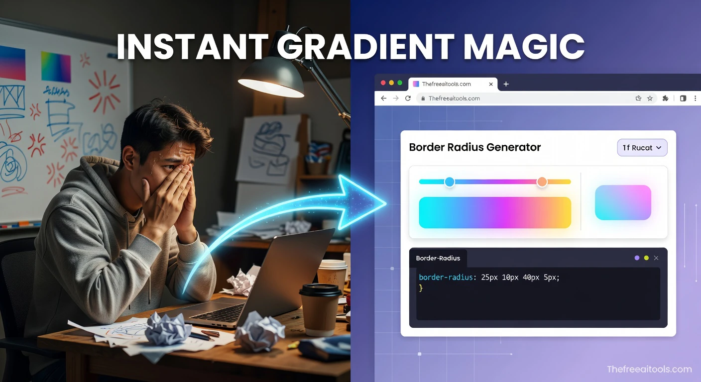
Generate CSS border-radius values for custom rounded shapes — visual editor with live preview and copy.
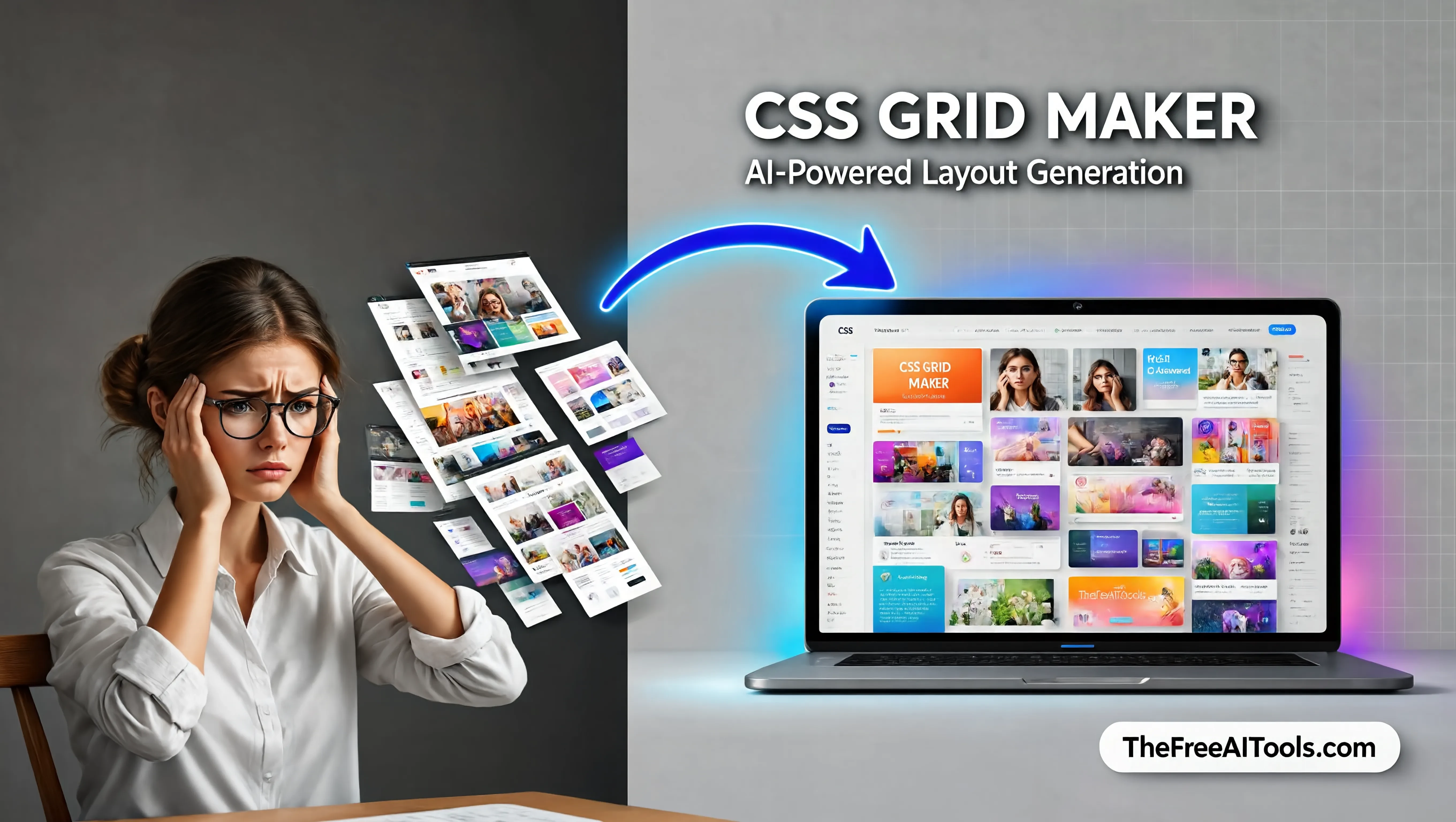
Build grid layouts visually and copy clean CSS for responsive interfaces in seconds.
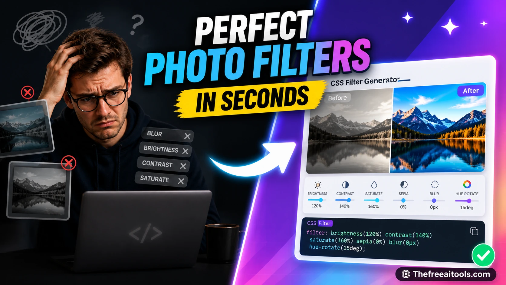
Adjust blur, brightness, contrast, hue-rotate, and saturation with live CSS filter output — instant visual preview.
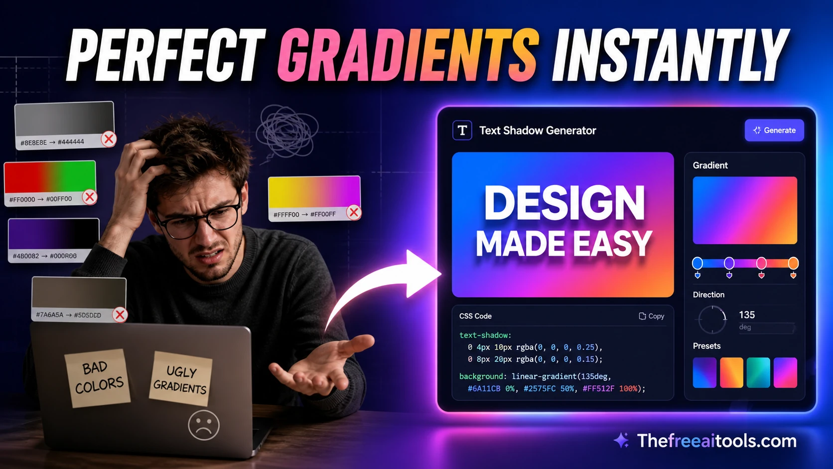
Generate CSS text-shadow values with a live headline preview — copy production-ready shadow code.

Create translate, scale, rotate, and skew transform CSS snippets visually — live preview and copy.
Generate CSS @keyframes animations with timing controls and live preview — copy production-ready code.
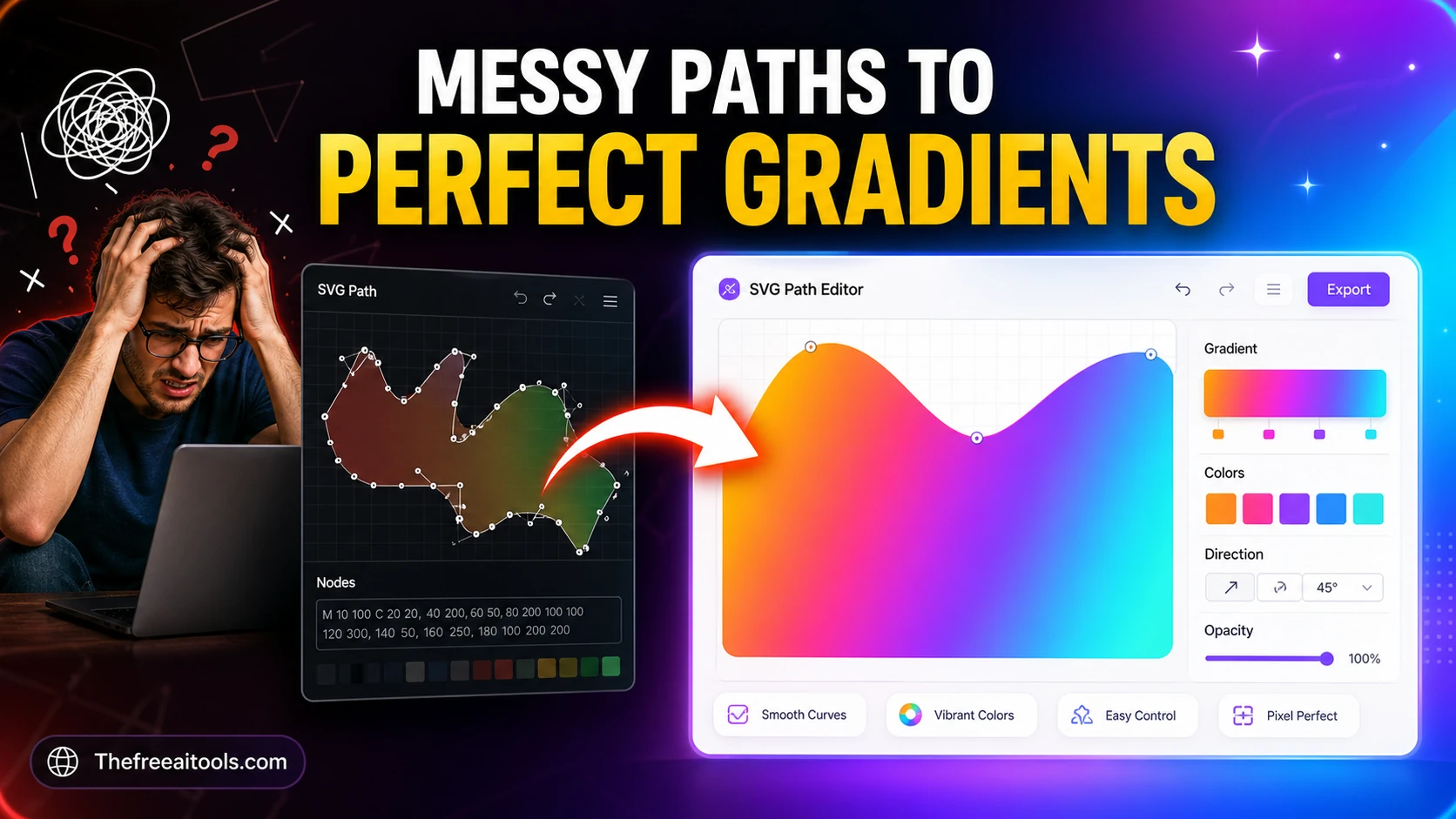
Compose and inspect SVG path commands visually — build custom shapes for logos and icons.
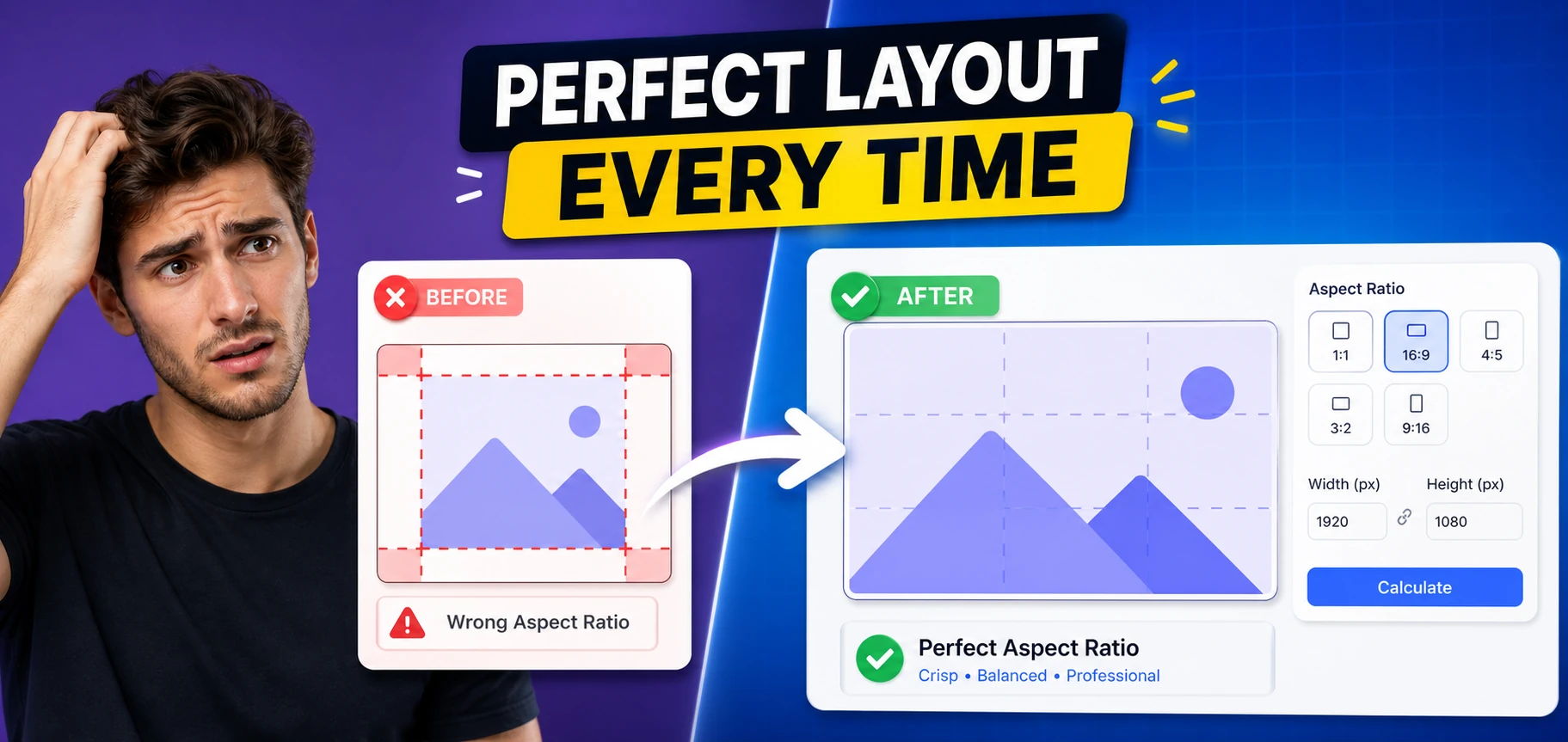
Calculate reduced ratios, responsive CSS padding tricks, and layout dimensions from any frame size.

Generate modular spacing scales for UI design systems from a base size and ratio — design tokens, no upload.
Create square avatar face concepts with randomized expressions, palettes, accessories, and copy-ready design notes.
Build responsive CSS Grid layouts visually with named areas, repeat helpers, and breakpoint previews. Designers and frontend teams can test layouts quickly before writing production CSS.
Combine multiple SVG icons into one optimized sprite sheet with symbol IDs, previews, and usage snippets. It makes icon systems easier to manage while keeping assets private and local.
Generate a consistent elevation scale (typically 5 levels from subtle 0 1px 2px shadows up to 0 25px 50px modal shadows), copy exact border-radius tokens, and lock colour values as HEX or HSL variables. HSL is the better choice for hover states because you can shift lightness by a fixed percentage and keep the hue stable.
Build eye-catching gradient backgrounds and hero sections without a designer. The conic and radial gradient generators produce effects that are difficult to write by hand, and the box-shadow tool lets you layer multiple shadows for realistic depth on cards and CTAs.
Run every text-on-background colour pair through the WCAG contrast checker before shipping. Normal text needs a 4.5:1 ratio for AA, large text needs 3:1, and #767676 on white is the famous borderline grey that passes AA for normal text at exactly 4.54:1.
Pick colours straight from a reference or mockup, convert between HEX, RGB, and HSL instantly, and translate a Figma auto-layout into a working CSS Grid template with fr units and auto-fill. Copy the generated grid-template-columns rather than hand-counting tracks.
You can generate linear gradients (with any angle), radial gradients (circular or elliptical, with positionable centres), and conic gradients (which sweep colour around a centre point and are ideal for pie-chart-style effects and colour wheels). Each generator outputs the full background or background-image declaration ready to paste.
When two complementary colours (for example blue and orange) blend in the default sRGB colour space, the midpoint passes through a desaturated grey. To fix it, add an intermediate colour stop or use a wider-gamut interpolation such as oklch. The gradient generator lets you insert extra stops to keep the transition vivid.
WCAG Level AA requires a contrast ratio of at least 4.5:1 for normal text and 3:1 for large text (18pt regular or 14pt bold). Level AAA is stricter: 7:1 for normal text and 4.5:1 for large text. AA is the legal baseline in most jurisdictions; AAA is recommended for body text on content-heavy pages.
Yes. The box-shadow generator supports comma-separated multiple shadows, which is how realistic elevation is built — a tight, dark shadow close to the element plus a softer, larger ambient shadow further out. You can also create inset shadows for pressed or recessed effects.
Yes. The colour picker outputs HEX (including 8-digit HEX with alpha), RGB/RGBA, and HSL/HSLA. HSL is particularly useful for generating tints and shades programmatically because you adjust a single lightness value rather than recalculating three RGB channels.
Yes. You can drop any generated value into a Tailwind arbitrary value, for example shadow-[0_10px_30px_rgba(0,0,0,0.15)] or rounded-[14px]. The output is standard CSS, so it also works in plain stylesheets, CSS modules, styled-components, and Emotion.
Hand-picked sets of free tools and guides related to design & ui.
224+ browser-based tools across 13 categories — all free, no sign-up required.